Syntax series


From Jacob van Loon's Syntax series.
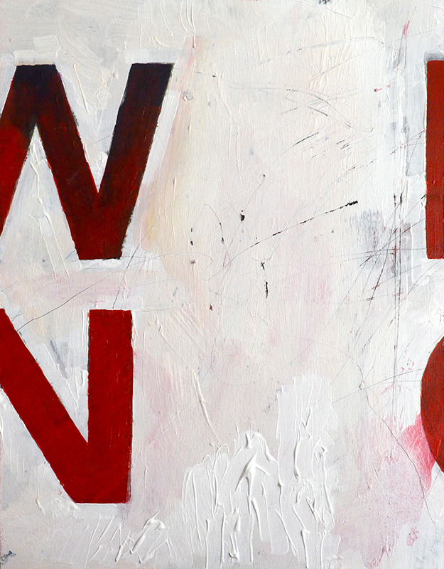
“Preparing for an upcoming exhibition in Chicago this summer, I decided to create a short series of works within Syntax, influenced by typographic forms and vehicles for text. For this polyptych, I used a slightly modified Avenir, chosen for its simple geometric structure and elegant form not always retained by typefaces in heavier weights. Split across four panels, each gap in the hanging composition allows the viewer to optically generate the missing information. The study was painted on birch panels mounted on 2” poplar, the risers painted the same hue and shade of orange-red as the bulk of the lettering.“
See: Behance project